How it lo0gs
I expect most people who read this are just swiftly taking in the information and don't give much of a thought to how the page looks. As somebody for whom making a living depends on attracting the eye of potential readers, I naturally give a great deal of thought to how this page looks. But trying to design a blog page for the internet in the old-fashioned print sense is folly. In the past i have relied on readers to tell me when something hasn't worked well on one of the variant browsers, so today when the wife of my bosom mentioned that my blog has become unreadable (on her monitor at work), it behooved me to do something about it. "Do you mean I'm using too many big words?" "No, I mean you're putting them all on top of each other."
This is how it looks to me on safari. Maybe you're familiar with it and maybe you're seeing it like this for the very first time. I'm particulary fond of the cunning motif of having the opening 'capital' overlap the header.

Firefox isn't too bad. It loses the neat drop shadow under the title lettering, but otherwise is faithful:

Opera picks up the drop shadow but does this odd thing with the sidebar, amputating it and shoving it as far east as it can go.

Explorer centers everything, loses the title altogether and puts the sidebar at the bottom:

That sound of a pencil hitting the floor, a stamping out of the room and a slamming of the door. That's me giving up and going to the pub.
Labels: goddamn computers
posted by Eddie Campbell at
00:26
![]()
![]()


13 Comments:
Eddie, I understand that some designers now simply refuse to deal with Explorer at all—or at least older versions of Explorer.
For example, IE6 users who try to visit the website "Momentile.com" are apparently welcomed with this image, commisioned from Canadian cartoonist John Martz.
It looks just great on Firefox, if that's any comfort.
Years ago people put little welcoming messages stating that said site looked best using such and such a browser.
I recommend "this site looks like shite in Internet Explorer"
As my husband would say, "Use a different browser."
Lookin' good on firefox.
IE sucks.
Then there's those of us who use Bloglines, who never see your beautiful layout and wonder what the fucque a big letter is overlaying your text for.
Time for another pint.
Fascinating.
On the other hand, I'm on of those people who plugs Sites I Care About through my rss reader thingy, which is the only way I can keep up with it all. Using the reader thingy all of the design effort folks such as yourself have put into the look of your homeport is made moot, because I'm only pulling the main content. I rarely go to homeports, because I generally don't comment on blogs, so I have no idea that there's Considered MultiBrowser-Friendly Design Stuff going on.
All this time I'd figured the giant orange letters were an odd quirk due to my reader screwing up how it pulls the info from your site. What I get is a giant orange letter, then I have to scroll down to find the rest of the content, or I get a giant orange letter with the first few lines of text crammed atop it. Yours is not the only site my reader has problems with...Spurgeon's entries load into my reader thingy as one giant block of text sans paragraph breaks or anything, making reading his dispatches difficult.
Now I feel guilty.
Pam In LA
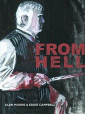
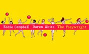
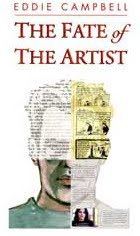
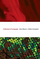
the way I justify the time spent on the blog is that the reader has to look at the ads for my books in the sidebar. So this RSS business is no friend to me. (though I know you've always kept up with what I'm working on, Pam, so that's not aimed at you really)
so I guess I should be TRYING to make it look unreadable on the RSS feed.
>>>so I guess I should be TRYING to make it look unreadable on the RSS feed.<<<
ahahahahahahaha!
Pam in LA
This is the greatest book in the universe for learning cross-browser HTML:
http://www.amazon.co.uk/Head-First-HTML-CSS-XHTML/dp/059610197X
The steam will stop coming out of your ears, I promise.
thanks, Johnny.
will check it.
i'm using IE and the first line of every post is shoved downwards, usually becoming entwined with the third line. when i try selecting the errant line, to highlight it, the highlighted selection is all as tall as the big orange letter.
i know, it's my fault, i should use firefox.
all the best.
i do beg your pardon.
the problem has been dealt with some weeks ago.
(i've been catching up.)
much appreciated.
ta (ta).
Post a Comment
Subscribe to Post Comments [Atom]
<< Home