covers- BACCHUS no.1


A lways on the lookout for stuff to show here, I noticed some interesting oddities in my master-file of Bacchus copies when I was looking in there recently. These include unused art, variations and interesting solutions to technical problems that you may find either educational or too Campbellian to be of any use to anybody anywhere. I'm just going to show a handful of the more interesting ones.
My first issue was fairly straightforward. The finished line art is dated Sept 1994 and the painting Nov. 1994 even though it wasn't to be released until May 1995. I would never again be this far ahead of the game in all my years of self-publishing. I even had time to make a concept sketch in pencil, and furthermore, to file a photocopy of it. The ink version appeared in black and white ads wherever needed. I had to look hard to remember who did what on it. I think Pete Mullins must have pencilled the girl and then I inked the whole thing. Pete then painted in acrylics over a photocopy of the line art made on the sturdiest paper or card that the copy machine could handle. Pete paints great hair. The third image is the colour xerox from my file, and these never looked 100% accurate; the flesh tones look too red, but on the other hand I remember being a little disappointed with the yellow on the finished print. The printed versions always looked dirty compared to the xeroxes and I came to expect that and make allowances. There's a warmer tone about the printed version which is perhaps a mix of aging paper and the different photographic process. Furthermore, the printer, Preney in Canada, lately defunct, had a rather annoying tendency to make things blacker than they needed to be, which means in painted work even the yellows will have an unwelcome amount of grey content. We were well underway before I got around to speaking to them about it. This was my first experience in buying printing and I didn't know much about the process. If things looked murky, I was inclined to think of it as an inevitability rather than something within my control. But after dealing with comic book publishers for some time Preney were in the habit of cranking up the output on the black inkjets. This is fine with black line art, but for painting it's all wrong. Also at this time, I had no idea how to put a logo on a cover other than by gluing it onto line art, which you can't do with colour. I simply left enough space for it, and asked Preney to put it on there in red with a black drop-shadow, in the same place as we put it in the completed black line ad. Thus the logos on my first five issues were pretty much left to chance.
posted by Eddie Campbell at
00:16
![]()
![]()


18 Comments:
This comment has been removed by the author.
That's really cool. I'd love to know more about some of your newest painted pages. You know how I love that painted comic art.
Unrelated heads-up: here's an interesting article on the Codex Seraphinianus, and here's where some's cracked the page-numbering system (but not the text).
i like the way the corner of her mouth squeeshes into his hat. that cheek is a pouch if skin, muscle & fat, sure enough.
of skin. dork.
Oh! Very nice cover! I've never seen that one.
Preney bit the dust, eh? I've never had much sympathy for them since they cowered to their right-wing customers over YUMMY FUR and TABOO. Hell...they almost killt TABOO before it had a chance to stand up.
Dear Sir,
Do you know where I might be able to get an original of some of your work, that is assuming you depart with your originals. I know there are people who sell comic art but would not know where to start. Hope this is not to cheeky but do you have any suggestions?
The reason is that I am an aspiring comic artist and would like to have a look at some originals, not to copy!, but to get a feel for how someone else/inspiring does it.
Also with regards to your problems with book ordering of university type books, have you any of you thought about joining your local university library. They usually welcome members of the public (esp artists/researchers)for reference use and for a small fee you can become a member with all the benefits that, that entails. I use my local univerity art library in brighton and it is superb.
cheers and apologies
lee paul christien
drjon
I mentioned one of those links a few days back. thanks for t'other.
Miriam
yes, the cheek. Pete played that up more in the painted version.
Lee paul,
I ve been selling my art as I go along over the years. I keep the core pages for my books, but covers and unusual stuff i let go. I do not really have very much left for sale and am still deciding what to do with the Black Diamond Detective Agency. I really don't know what is available out there. If i looked i'd only be depressed to see what prices it's going for on ebay or whatever.
I used the local State and University libraries a great deal until recently. I used to just love to go there and hang out and let my thoughts take me from one shelf to another. Refurbishing and temporary distribution of the books to locations around town weaned me from the habit alas.
also, I love to 'have' books... see my Apil 1st post.
eddie
Ah, the iniquities of printers...you have my sympathies. The best album sleeve I did for Hawkwind in 1985 was poorly photographed (or something) so it came out with an unintended blue cast. Things are better today because you can embed colour profiles in the artwork but it's still a worry. CD work is a pain because the printers are an adjunct to pressing plants and consequently have lower standards than book printers.
Chief,
Cheers anyway, hope you will excuse my asking sir.
For sure its nice to 'have' books as you say, but for quick reference or a bit of a browse,the art library near me always comes up with the goods.
Theres nothing like drifting around and seeing where you end up, especially if you buy into the surrealist (and later situationist)idea of chance generating, confirming, contradicting ideas.
Anyhow
lee
Dear Mr. Campbell--
For some reason found myself reminded of the slapstick kiss from your strip 'The Accountant, Chalky White'. Decided to do a larger version of it as a virtual gift for you, but failed to take into account the size limitations of my scanner and made it grotesquely large. Took a photo, anyway.
http://www.flickr.com/photos/mnemonic_boxes/502131362/
Will try to scan it in bits and assemble it properly later.
Thanks for being an inspiration!
-David
Beautiful! I love seeing the jump from sketch to drawing to painting.
And I share your frustrations with the vagaries of offset printing--I had a cover come back from the printer a little while back for a film called Green for Danger, and it didn't occur to the printers that something might not quite be right when all the green on the cover printed as bright blue... We wound up reprinting the whole run.
Lovely cover as an example...but I really liked the b&w ink the best. The color lost some of the intensity for me.
David
Got a laugh out of that. Cheers
Erik
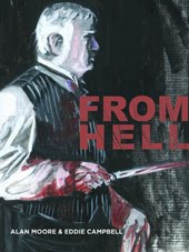
Blue? I once got a proof back from pre=press where the red streak on the From Hell movie edition cover was GREEN. They hadn't even looked at the bubble-jet sample I'd included as a guide. the time that gets wasted.
mrtractor
the b&w ink stage?
In everything i do I always feel I never bettered the pencil sketch. including above.
I also just adore the B&W. And I wondered what the colouring would [perceptively] look like with the gorgeous inks on top. So... I couldn't resist dabbling since you'd posted both. Hope you don't mind.
http://heyniceshoes.com/maggie/other/bacchus_layered.jpg
David
You had me worried for a moment then, because I couldn't recall kissing Campbell.
Nice piece btw.
"Chalky"
Eddie--
Oh sure, I've seen more egregious printing errors, I just find that one particularly amusing because it said "GREEN" in big letters smack dab in the middle of the thing and that still didn't raise any flags for anyone.
(Cover in question here:
http://www.ericskillman.com/greenfordanger.html)
Though I have to say, I'm not even sure what they'd have to do to get red to print as green... load the wrong inks into the press? Reverse the plates? The mind boggles...
Eric
Great cover. Has a cool look of 'comics' about it.
Maggie
Enjoyed your 'remix'.
thanks for the fun
Chalky
You don't even rememeber...?
Eddie
Post a Comment
Subscribe to Post Comments [Atom]
<< Home